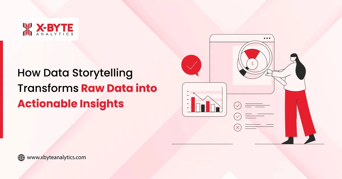
Quick Summary:
The global data visualization market is growing rapidly today. It is expected to reach big numbers in the next decade. Tools transform complex data into clear visuals, which help in enabling faster decisions and better communication. Leading platforms offer interactive dashboards and real-time updates to suit different business needs. Selecting the right tool enhances data understanding for the client. It also supports effective teamwork in a data-driven world.
The global data visualization market is forecast to reach $25 billion by 2034. This shows how this market is constantly growing day by day. This growth makes choosing the right data visualization tools important for every business.
Modern data visualization platforms turn raw data into easy-to-understand charts, graphs, and dashboards. They connect to many sources and help teams quickly spot trends and patterns. These tools offer interactive dashboards that update automatically. This keeps data updated and supports faster and clearer business decisions.
Selecting the right data visualization software is an important step for companies focused on better communication and insights. This blog covers popular tools and their features, which can help users choose the best one for 2025 and the future.
Why Data Visualization Tools Are Essential?
The Importance of Data Visualization has grown significantly as data expands each day from many sources. The global market for data visualization is expected to reach big numbers in the 2030s. This rise shows how important it is to find the right tool for handling data clearly.

1. AI-Driven Visualization Enhancements
AI-driven dashboards turn complex data into clear insights. They explain trends in plain language, pick the best charts automatically, and help users understand information quickly and easily.
2. Automation Streamlining Workflows
Automation reduces repetitive work by updating dashboards and reports automatically. It accelerates data processing and allows analysts to focus on deeper insights. This leads to faster and more accurate decision-making.
3. Predictive and Prescriptive Analytics Integration
Visualization tools embed AI to forecast trends and simulate scenarios. Users can plan ahead and adapt strategies based on visualized predictions. This helps in risk management and opportunity recognition.
4. Real-Time Streaming Data Visualization
Dashboards handle live data streams, providing instantly updated insights. This is vital for fast-paced sectors like finance, retail, and manufacturing. Real-time visualization supports timely interventions and actions
Factors to Consider When Choosing the Right Data Visualization Tool
The selection of the best data visualization tool is very important. It must be appropriate to the business and the kind of data it works with. This makes for smooth work and clear results.
| Tool | Pros | Cons |
| Qlik Sense | 1. Fast visual story creation 2. Identifies subtle data relationships 3. Intuitive dashboards 4. Does not require heavy technical skills | 1. Advanced features have a steep learning curve 2. UI may feel unfamiliar for some users |
| Looker | 1. Strong Google Cloud integration 2. Consistent and reliable reporting 3. Highly customizable dashboards | 1. Requires semantic modeling setup (LookML) 2. Some workflows rely heavily on Google’s ecosystem |
| Zoho Analytics | 1. Quick reporting and dashboard creation 2. Ready-to-use templates 3. Strong data blending features 4. Secure collaboration | 1. Fewer advanced features compared to enterprise-level tools 2. Learning curve for in-depth analytics |
| Thought Spot | 1. Instant AI-powered insights 2. Natural language search 3. Automated AI dashboards 4. Easy integration with apps like Salesforce and Slack | 1. High cost for enterprise use 2. Reporting features may feel limited for complex analytics |
| Tableau | 1. Wide range of rich visualization options 2. Strong global community and support 3. Excellent deep-dive analysis tools | 1. Licensing can be expensive 2. Performance may slow with extremely large datasets |
| Power BI | 1. Seamless integration with Microsoft 365 & Azure 2. Auto-refresh dashboards 3. Budget-friendly compared to competitors | 1. Advanced features may require technical knowledge (DAX, Power Query) 2. Limited flexibility outside Microsoft’s ecosystem |
| Domo | 1. Very user-friendly interface 2. Rapid dashboard building 3. Wide range of integrations | 1. Limited customization for complex needs 2. Advanced analytics capabilities are not as strong as competitors |
1. Data Merging and Compatibility
A suitable tool integrates with multiple sources of data with ease. It must deal with files, databases, and the cloud. This facilitates the collection of data in one location and the ability to visualize it all.
Different types of data are not amenable to all tools. Select one that integrates into existing systems. Compatibility is not a hold-up or extra work.
2. Usability and Learning Curve
Data visualization software should be easy enough for non-specialists to use. The design is intuitive enough that the teams can generate the visuals with minimal support.
Training time ought to be short in order not to waste resources. Others allow for drag and drop to create the charts. This decreases dependence on IT and accelerates reporting.
3. Security and Data Governance
Security in data visualization tools means protecting data from unauthorized access or leaks. The tool should offer encryption, role-based access control, and compliance with laws. It must ensure that sensitive information is hidden.
Good tools maintain transparency so users can track where the data comes from and when it was last updated. This builds trust in visualizations and preserves integrity.
4. AI/ML Capabilities
Modern data visualization tools increasingly use AI and machine learning to simplify analysis. AI can spot patterns and trends humans might miss. It often uses natural language processing so users can ask questions in plain language and get immediate visuals.
AI also personalizes dashboards to show what matters most for each user. These smart features reduce manual work and speed up insight discovery.
5. Visualization Options and Customization
Different kinds of data can be visualised using different charts on different data visualization platforms. Seek out tools that use bar graphs, pie charts, maps, etc. Various colors and styles can be personalized to fit the company’s colors.
Flexible visualizations give users the ability to emphasize or annotate important data. This makes information more transparent and easier to share with others.
6. Price and Scalability
Cost is important, but shouldn’t be the only consideration. Some tools are free or inexpensive for a certain number of users and/or features, but become costly when more users/features are added.
Scalability is essential as data requirements grow. It should scale with the business to manage more data and users. This safeguards the investment.
Drive Business Transformation With X-Byte Analytics’ Data Visualization Services And Gain Actionable Insights Quickly!
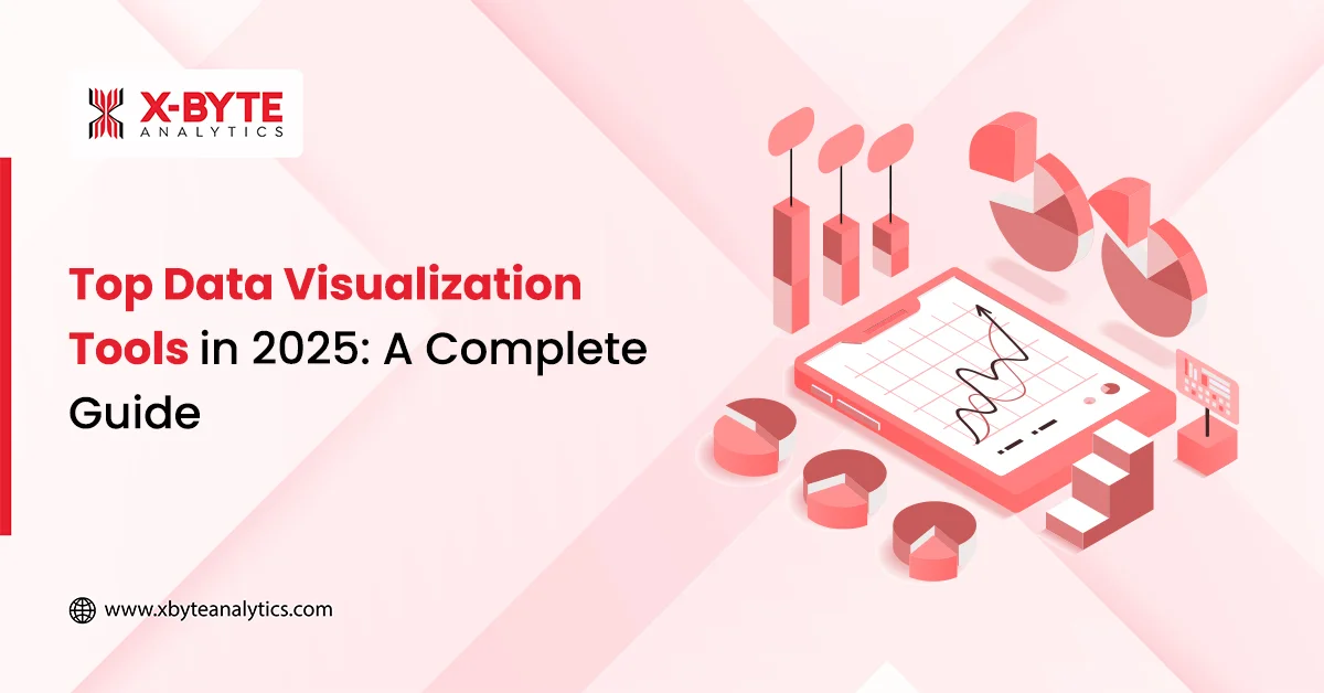
Top Data Visualization Tools
Data is growing, and businesses need to see it clearly. Advanced data visualization tools convert complex data sets into graphs and images. This facilitates improved decision-making and analysis of massive data sets.
1. Qlik Sense
Qlik Sense empowers teams to turn raw data into interactive visual stories. Its associative engine uncovers hidden relationships that typical queries often miss. Users can drag and drop data to create dashboards that explain trends quickly.
It supports self-service exploration that lets decision-makers find answers without relying on technical teams.
2. Looker (Google Cloud)
Looker helps organizations explore data through an intuitive and scalable interface. It integrates well with BigQuery and other Google Cloud tools to simplify reporting tasks.
Its semantic modeling layer ensures consistency across all reports. Teams can share real-time metrics and build customized visualization dashboards that align with business needs.
3. Zoho Analytics
Zoho Analytics enables effortless reporting with automated data blending from multiple sources. It offers ready-to-use visualization templates that present key insights instantly.
Smart data preparation tools make handling large volumes of information simple. Users can collaborate securely and track metrics through dynamic dashboards that adjust as data changes.
4. ThoughtSpot
ThoughtSpot offers real-time insights using natural language searches. Their AI dashboards are automatically updated to have real-time data. It easily connects with applications like Salesforce and Slack.
It offers contextual reporting, analysis capabilities, and automated alerts. The teams can develop and experiment with visualizations without too much technical expertise.
5. Tableau
Tableau has a large variety of customizable visualizations. It supports blending complex data and building detailed dashboards. Reports can be built using a drag-and-drop interface.
The growing and strong community of developers ensures the continuing relevance of Tableau. It is well aligned with the user’s need for powerful exploration tools.
6. Power BI
Power BI works seamlessly with Microsoft products. It offers drag-and-drop dashboards and deep data modeling. Its auto-refresh function keeps reports up to date. Through Power BI development services, businesses can further enhance these capabilities and build customized analytics solutions.
The platform allows for change analysis and broad visualizations. It is inexpensive and widely used by companies within Microsoft’s ecosystem.
7. Domo
Domo has a very simple interface and quick dashboards. It handles multiple sources of data and includes the management of AI models. Collaborative capabilities enhance data-oriented collaboration.
Users benefit from customizable reports and low-code data modeling. Domo focuses on user experience and broad integration capabilities.
Conclusion
This blog covered how data visualization tools for businesses aid the interpretation of complex information into clear insights. Good visualizations provide a clearer and more actionable view of the data, leading to enhanced performance and decision-making in businesses.
Selecting the appropriate visualization tool to deploy is key to good communication. It also enables teams to identify trends, make comparisons, and communicate results with ease and precision, especially when supported by expert data analytics consulting services.
X-Byte Analytics can help you alleviate this need. Our custom solutions help turn your data into live information for faster and better business decisions. Give us a call to find out how our custom visualizations can help you turn data into actionable insights to do your business better.