Quick Summary
Data analytics and data visualization are the key pillars for a business’s success. If you are a business struggling in the world of AI and analytics, these two can be game changers for you. From customer acquisition to inventory management, no matter where the issue is, data is your god. Let’s read ahead and learn in-depth about data analytics, data visualization, their benefits and differences.
Introduction
Data has become an indispensable asset for businesses. Whether it is about streamlining inventory, ensuring product quality, or reducing production downtime, access to respective data can help in proactive strategy formulation and implementation. In the process of data handling, several processes play a critical role, including data analytics and data visualization.
Data analytics and data visualization are two essential pillars of modern business intelligence. While data analytics focuses on examining raw data to uncover patterns and drive decisions, data visualization transforms those insights into clear, visual formats that are easy to understand and act on. In this blog, we break down the key differences between data analytics and data visualization and explore how each contributes to effective data handling.
By the end, you’ll know exactly how understanding this difference can help you interpret data more confidently and make smarter business decisions.
What is Data Analytics? A Complete Overview
Data analytics is the end-to-end process of collecting, organizing, cleaning, and transforming raw data to uncover meaningful patterns & insights. It involves applying statistical techniques, analytical models, and data-processing tools to identify trends, validate assumptions, and support informed business decision-making.
By turning raw information into actionable intelligence, data analytics helps organizations optimize performance, predict outcomes, and solve complex problems.
The methods that support the discovery of patterns and relationships are
- Statistical Techniques: These can be used to summarize data, test hypotheses, and quantify trends.
- Algorithms: Step-by-step computational procedures that automate analysis and enable deeper insights.
- Analytical Models: These are structured frameworks that help interpret data, predict outcomes, & guide decisions.
In other words, the role of data analytics in businesses is to help them turn a pile of numbers or records into useful information.
Here is an example to understand well.
Suppose an online store wants to improve sales. They gather data aspects, such as
- How many visitors came each day
- What product pages did people look at
- How many made a purchase
And more. A data analyst might use that data to find that 20% more people buy when they view a product’s video than when they don’t. Based on that insight, the store could add videos to all product pages.
What are the Types of Data Analysis?
Now that you are clear on what data analysis is, let’s dive into the types of data analysis. There are primarily 4 types of data analysis, elaborated below. Each one of them answers a different question, and they build on one another.
| Type of Data Analysis | Description |
| Descriptive Analytics (What happened?) | This type of data analysis analyzes the historical data and summarizes it. For example, monthly sales figures, website traffic over time, or how many customers churned last quarter. Techniques include dashboards, charts, reports, or aggregating data. This analysis does not try to explain causes or predict the future. |
| Diagnostic Analytics (Why did it happen?) | With diagnostic analytics, businesses can look deeper into past data to find reasons behind events or trends. You may notice a drop in sales & then use this type to find that a supply issue or a competitor’s price drop caused it. It uses correlations, drill-downs, root cause analysis, & data discovery. |
| Predictive Analytics (What might happen?) | This kind of data analysis uses statistics, machine learning, or forecasting to predict future events based on historical patterns. For example, predicting 1. Which customers are likely to churn 2. What the next quarter’s sales might be 3. Which machine may cause downtime 4. whether demand will rise in a certain region This analysis is based on probabilities—not certainties. |
| Prescriptive Analytics (What should we do about it?) | This is the most advanced type of data analysis. Building on the predictions and diagnostics, prescriptive analytics recommends actions or decisions. It may simulate various choices, optimize for constraints (like cost, time, and resources), & show which path leads to the best outcome. For example, recommending product discounts, optimizing delivery routes, or adjusting marketing spend. |
What are the Components of Data Analytics?
The data analytics lifecycle is a structured, step-by-step process that guides how raw data is collected, prepared, analyzed, and transformed into actionable insights. To fully understand this lifecycle, it’s important to first know what is data analytics, as the process of data handling or analytics has a number of components or steps. Each of these steps treats data differently. Here is a step-by-step elaboration.
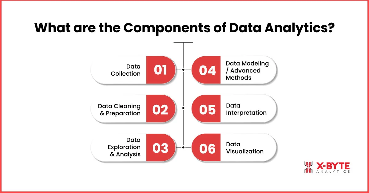
1. Data Collection
This is the first step in the data analytics process, where you gather raw data from various sources, such as
- Databases
- Sensors
- Surveys
- APIs
- Logs
- External datasets
The aim is to collect data relevant to your business questions or objectives.
2. Data Cleaning & Preparation
This is one of the most critical components of data analytics. In fact, according to statistics, Data scientists spend an estimated 60-80% of their time cleaning and preparing data. Raw data often contains errors, missing values, duplicates, or inconsistent formats.
Cleaning fixes these issues; that includes
- Removing duplicates
- Handling missing entries
- Standardizing date formats
Preparation may include transforming data, normalizing values, data annotation, encoding categorical fields, and merging datasets to get a clean, uniform dataset.
This stage often involves the ETL (Extract, Transform, Load) process, where data is extracted from multiple sources, transformed through cleaning and formatting. The data is then loaded into a central system or analytics environment. ETL ensures that analysts work with consistent, reliable, and analysis-ready data.
3. Data Exploration and Analysis
This step is also called exploratory data analysis (EDA), where businesses use charts, summary statistics, & visual tools to survey the data. There are several insights that you can uncover in this step, such as
- Find distributions
- Spot outliers or odd patterns
- Check correlations between variables
- Get familiar with what’s inside the data
Businesses often use various tools to perform EDA efficiently and visually. These tools include,
- Python (Pandas, NumPy, Matplotlib)
- R
- Power BI
- Tableau
- Jupyter Notebooks
These tools help analysts quickly explore data and identify meaningful trends before deeper analysis begins.
4. Data Modeling / Advanced Methods
At this stage, you apply algorithms or models to detect deeper patterns or make predictions. The choice of model depends on your objective and the nature of the data. These models and algorithms include
- Regression
- Classification
- Clustering
- Forecasting
And more. Besides, there are several modern-day AI/ML models that help businesses build more accurate, scalable, and intelligent data-driven solutions.
- Neural Networks for complex pattern recognition
- Deep Learning Models like CNNs, RNNs, Transformers, etc., for image, text, and sequence analysis
- Ensemble Methods like Random Forest, XGBoost, LightGBM, etc,. for high-accuracy predictions
- Natural Language Processing (NLP) for extracting insights from text data
- Reinforcement Learning for decision optimization.
5. Data Interpretation
In this stage, businesses convert model outputs or analytical findings into meaningful conclusions. The key questions include:
- What do these results mean in real-world or business terms?
- Do the results align with expectations?
- What assumptions or limitations should be considered?
This step ensures that insights can guide practical decisions and are not misinterpreted.
6. Data Visualization
The final and the other one of the crucial components of data analytics is presenting the findings in a clear visual form. Data can be presented in the following forms, including
- Charts
- Graphs
- Dashboards
- Maps
Good visualizations help stakeholders quickly grasp insights, compare trends, and make decisions. As per stats, 74% of organizations that use visual data discovery empower managers to make decisions when necessary.
What is Data Visualization?
Data visualization is a part of the data analytics process that deals with displaying information and data in a visual or graphical form, such as
- Charts
- Graphs
- Maps
- Dashboards
- Infographics
These help in making complex data easier to understand. Through data visulization consulting services, organizations can better interpret visual insights, quickly spot patterns, trends, outliers, or relationships that would be hard to identify in spreadsheets or raw numbers. Visualization turns data into stories and supports better decisions.
What are the Types of Data Visualization Techniques?
Several types of data visualization techniques can be used to represent data. Picking the right technique helps people see patterns & understand the message clearly.
| Type of Data Visualization | Description |
| Bar Charts | Bar charts are ideal for comparing values across categories. For example, comparing sales in different regions or product types. |
| Line Charts | You can use line charts to show trends over time, like how website visits increase or drop month by month. |
| Heatmaps | Heatmaps are used with various colors to represent values in a grid. They help spot hot spots, patterns, or anomalies, such as high activity zones on a website or in a map. |
| Scatter Plots & Bubble Charts | These show relationships between two (or more) variables. Bubble charts add another dimension using the size (or color) of bubbles. These two visualization techniques are good for spotting clusters or outliers. |
| Treemaps | Display hierarchical data where areas of nested rectangles represent parts of a whole. Treemaps are useful when showing how categories are broken down. |
| Maps/Choropleth Maps | Use geography; colors or shades show differences across regions, such as 1. Population density 2. Income 3. Sales by state And more. |
Partner With X-Byte Analytics To Unlock The Full Potential Of Your Data Visualization Service Today!
Data Visualization Tools
To turn insights into visuals, you need tools that can handle both the data side and the design side. The right tool helps you create charts, dashboards, maps, and more faster, clearer, & more in an engaging way.
Here are some well-known data visualization tools!
- Tableau: it is ideal if you are looking for interactive dashboards, as it can connect to lots of data sources.
- Microsoft Power BI: The tool integrates perfectly with the Microsoft suite. It is considered good for business reporting & visual dashboards.
- D3.js: A flexible JavaScript library that is great for custom, web-based visualizations if you have coding skills.
- Google Charts: A simple and free data visualization tool that works perfectly for embedding charts into websites or smaller-scale reports.
- Zoho Analytics: This tool combines business intelligence and visualizations, making it suitable for medium to large setups.
If you deal with data analytics, these tools must be a part of your tech stack.
What are the Advantages of Data Analytics and Visualization?
When data analytics and data visualization are paired together, the benefits multiply. Together, they help organizations do more than just observe; they enable action. Here are some key advantages.
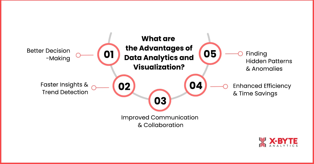
1. Better Decision-Making
Data analytics helps in uncovering insights, trends, correlations, and forecasts, and visualization makes them clear. This leads to decisions based on facts, not guesswork, reducing risk & improving outcomes.
2. Faster Insights & Trend Detection
Visualization tools turn large, complex datasets into intuitive graphs or dashboards. It becomes much easier to spot changes, unusual patterns or opportunities early, like seasonal trends or rising customer needs.
3. Improved Communication & Collaboration
Visual formats are understood more quickly by people, including non-technical stakeholders. Graphs, dashboards, and infographics help teams across departments align, share insights more clearly, & act together.
4. Enhanced Efficiency & Time Savings
Instead of sifting through pages of dry numbers, visualizations let people see what matters at a glance. Real-time dashboards or automatic reports save time. Resources get focused where they make the most difference.
5. Finding Hidden Patterns & Anomalies
Analytics compute patterns, but visualization makes them obvious. Outliers or data quality issues that might be lost in raw data become visible. That allows corrections and, better, more reliable insights.
What are the Differences Between Data Analytics and Data Visualization?
After discussing the benefits of data analytics and data visualization, let’s head to the differences between data analytics and data visualization.
| Aspect | Data Analytics | Data Visualization |
| Definition / Purpose | The process of examining, cleaning, transforming, and modeling data to extract insights, make predictions, and support decision-making. | The practice of representing data in graphical or pictorial formats (charts, graphs, maps, dashboards) to make complex information easier to understand. |
| Depth of Work | The depth of work is deep, including 1. Statistical methods 2. Pattern detection 3. Diagnostics 4. Predictive or prescriptive modeling. Understanding “why” and “what next.” | Data visualization is more about showing results, trends, comparisons, and anomalies in a way that is visually easy to interpret. It is less about building the model or doing deep statistical inference. |
| When It’s Used | It is used in early/middle stages of data work, such as collecting, cleaning, exploring, analyzing, and modeling. | Data visualization is used in the later or parallel stages where presenting, communicating, sharing insights, & making dashboards/reports are carried out. It is also used during exploration to see patterns visually. |
| Skills/Tools | 1. Statistics 2. Programming 3. Data manipulation 4. Algorithm design 5. R 6. Python 7. SQL 8. Machine learning frameworks | 1. Visual design 2. Choosing appropriate chart types 3. Storytelling 4. User interface 5. Tableau 6. Power BI 7. Chart libraries 8. Dashboards |
| Outcome | Insights, models, predictions, and explanations. You can learn what trends are there, why they happen, and what might happen. | Visual artifacts, such as 1. Charts 2. Dashboards 3. Graphs And other tools for communication, making insights accessible & understandable. |
Conclusion
Whether you are in the construction business, manufacturing, telecom, or whatnot, data can be a great asset for you. However, raw data cannot be useful as it is. You have to clean and annotate it before making sense of it. Data analytics and data visualization are two critical processes that can help you make sense of the data and subsequently grow your business.
With comprehensive data analysis and interactive data visualization, businesses can make smart decisions for their workflows, inventory, logistics fleet, etc. As data management can be a challenge for those new to the market, we at X-Byte Analytics offer professional data analytics consulting services. With the power of advanced tools and an adept team, we handle everything from data acquisition to data visualization.